COMPANY ANALYSIS:
Catered by Patti Caces is an established professional catering company in Central Florida that has thrived on its solid reputation. Although there is not a significant digital presence, the company maintains a successful business with both wedding and corporate clients. Their mission is simple: to take care of their clients. They do so by serving high-quality (and delicious) cuisine while providing high-quality service. Based on their reviews, I’m not surprised they’ve been successful with little digital marketing — word travels fast when you have happy clients. Establishing the brand online, however, will certainly help the company reach and engage a much larger audience of potential clients.
The company’s current goal is to further expand their list of corporate clients in the film industry by providing on-set catering and craft services during local productions. With this in mind, the target audience of their new brand identity campaign should be these corporate clients, while still being inclusive of their wedding clients. In order to reach this diverse group of clients, I recommend the company follow best integrated marketing communication (IMC) practices. IMC is the development and execution of a cohesive multi-channel identity campaign that immerses the target consumer in a consistent experience every time they encounter the brand. We want every consumer who encounters the name “Patti Caces” to immediately associate the name with professional catering, quality customer service and delicious products.
Currently, the company appears to go by a few different names online, including 1st Choice Production Catering, Catered by Patti Caces, and simply, Patti Caces. Fragmentation in the company name might create confusion among consumers. According to a Bloomberg Business article, fragmentation is the number one enemy of successful brand marketing. The solution? IMC. Catered by Patti Caces needs to promote a cohesive identity across all of their marketing channels, including consistent use of company name, messaging, visuals and voice, in order to build a solid, recognizable brand.
MY STRATEGY:
To relaunch the Patti Caces brand with a wide online presence, I’ve designed an IMC campaign that will help establish a modern visualization of the brand. I designed the company’s brand identity with the name “Catered by Patti Caces” in order to take advantage of the company’s existing name recognition while keeping their services obvious to new potential clients. The overall feel of the brand design is bright and crisp, appearing well-established yet energetic and fresh. I kept the designs flexible, focusing more on the company’s dedication to product and service than the types of clients they serve. The campaign successfully draws attention to the Catered by Patti Caces name while highlighting their on-set catering business, a service that might not be immediately known to their other established clients and so needs further promotion.
DESIGNS:
Logo:
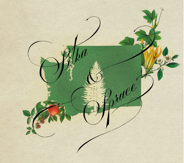
The logo should encapsulate the brand’s essence while still being simple and flexible enough to appear in a variety of print and digital forms. I designed the logo in two parts: a symbol and a text portion. The logo could be used as a whole or split depending on need, and can also be arranged vertically (as it appears here) or horizontally. The color palette is bright, fresh and appropriate. The symbol is telling, yet simple. Each circle represents a tier of the Catered by Patti Caces business: professional service, baking and cakes, and quality cuisine. The circles link, representing the business being built on all three of these values. The text portion of the logo features a modern font pairing that places emphasis on the Patti Caces name. I created the tagline, “Motivated by quality, inspired by you, since 1988,” to again highlight the values while emphasizing the well-established nature of the business. To remain flexible, the tagline need only accompany the logo when appropriate. The logo provided is currently set to a digital-appropriate resolution (72 dpi), however a higher resolution image appropriate for print could be easily provided at the company’s request.
Full color logo for Catered by Patti Caces
Grayscale logo
Reverse/dark background logo
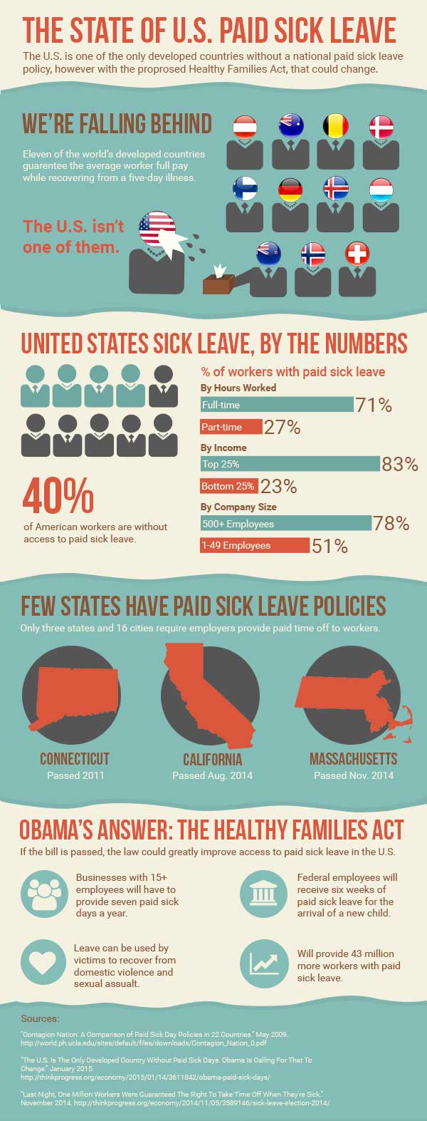
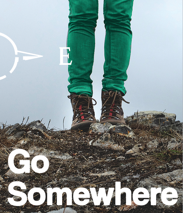
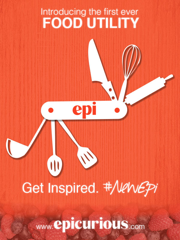
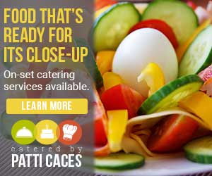
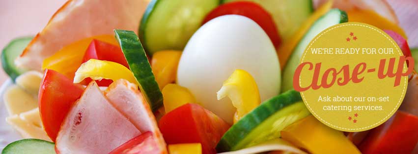
Banner Ads:
The banner ads I created utilize the logo and continue its color palette and typography in order to remain visually consistent. These banners are for use on the Catered by Patti Caces website and could also be used to advertise on other appropriate websites. The specific promotion focuses on both the quality nature of the company’s products while highlighting the on-set catering service. The ads are simple, featuring large, enticing images and bold type. The call to action here is to learn more about the film catering arm of the business that many clients or potential clients might not think of when they think of “Patti Caces.”
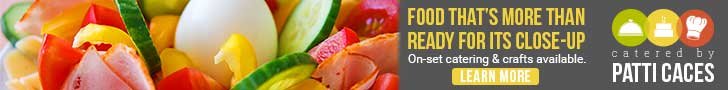
Leaderboard banner
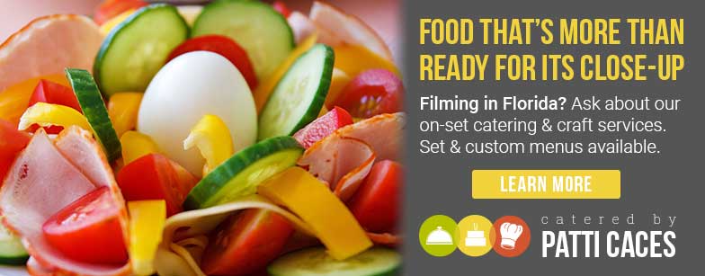
Enhanced leaderboard banner
Cube banner

Button banner
Animated cube banner (if not playing, please click to reopen in new tab)
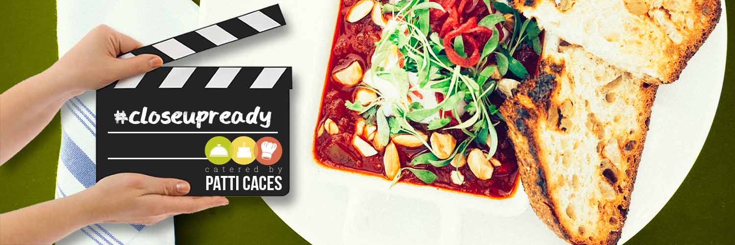
Social Media:
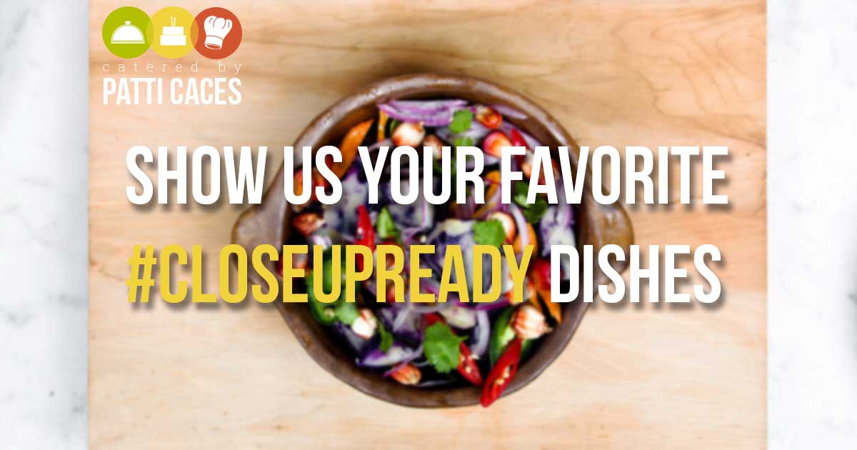
I created a social media branch of this campaign as these platforms are known for potential high levels of engagement with brands. I’ve provided several cover page options for Facebook, as well as an option for Twitter. I also designed a transparent overlay that could be used on images posted to Instagram or Pinterest. To promote engagement with the brand, I created a hashtag (“#closeupready”) users could add to their own posts and share back with the Patti Caces social media pages. Despite differences in design, the overall look and feel of each is consistent with the brand identity I created.
Facebook cover image (Option 1)

Facebook cover image (Option 2)

Facebook cover image (Option 3)
Twitter cover image
Overlay graphic for use on Instagram or Pinterest
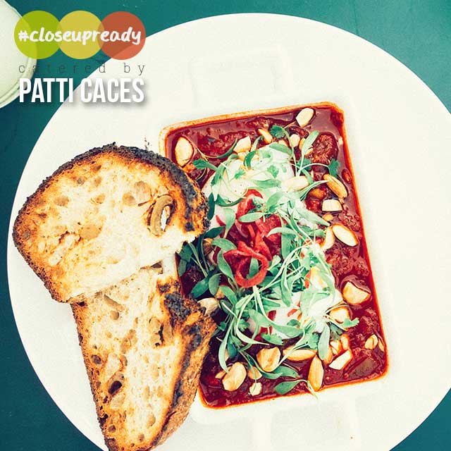
Potential graphic to share on Facebook
Email:
I designed an email to accompany this campaign that could be sent out to the company mailing list. Again, the promotion draws attention with gorgeous food photos, while inviting recipients to learn more about the film catering services. To be inclusive of other types of clients, I’ve included a smaller promotion related to weddings, a recent client testimonial, and a call for clients to follow the company on Pinterest, an important IMC channel for businesses such as this one (more on that to come). As you can see, the email continues with the color palette and bold typography inspired by the logo for visual consistency.
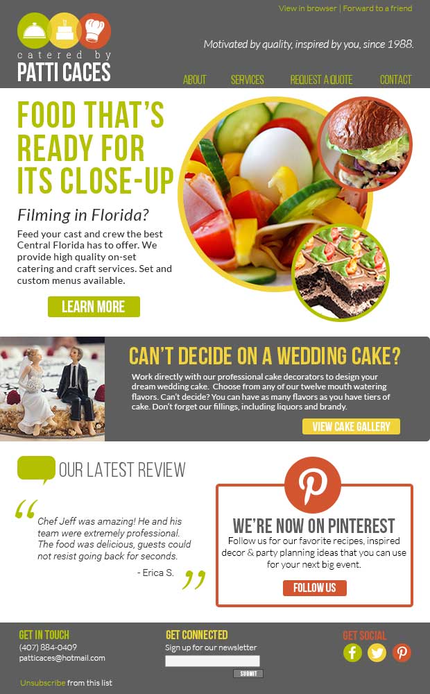
Sample email featuring my campaign
Website:
Now that I’ve created these various “touch points” where consumers can encounter and engage with the Catered by Patti Caces brand, there needs to be a central point where these consumers can ultimately learn all they need to know about the business. Today, that point is overwhelmingly a functional and updated website. The website homepage is designed very much like other pieces of the campaign with large photos that can draw in potential clients. Although bright and colorful, with color palette and typography consistent, the content is provided in a simple, easy-to-use fashion. A rotating image gallery would include current promotions (such as the one I’ve designed for the on-set catering business) while the body of the site would direct potential clients to various pages featuring services the company provides. Client testimonials on the homepage can also help attract potential clients by giving them just enough to convince them to reach out to the company for more information. The footer of the website would also provide potential clients with various ways to engage with the company, including basic contact information, signing up for the mailing list, or following on social media.
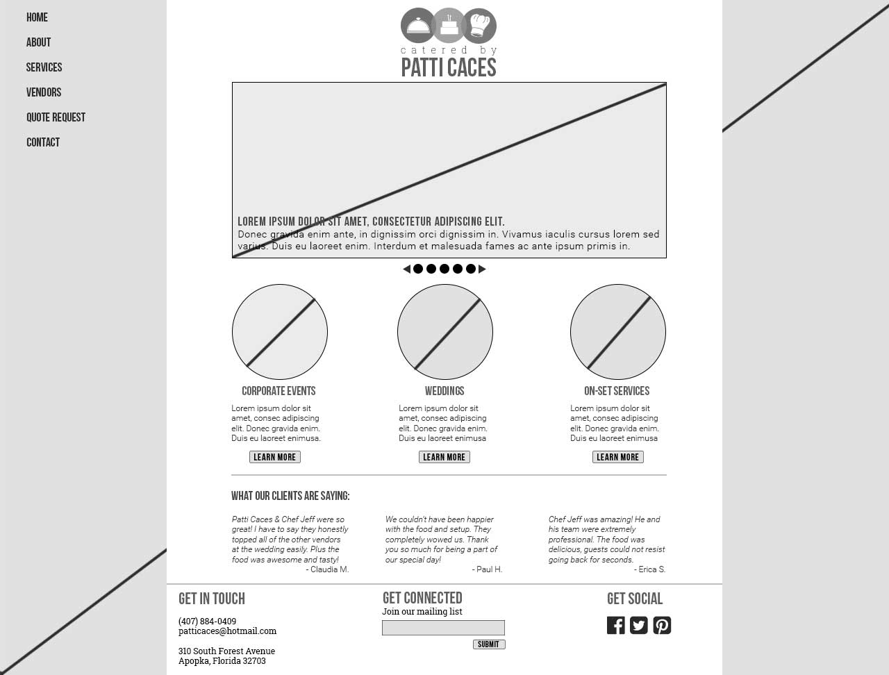
Website wireframe design
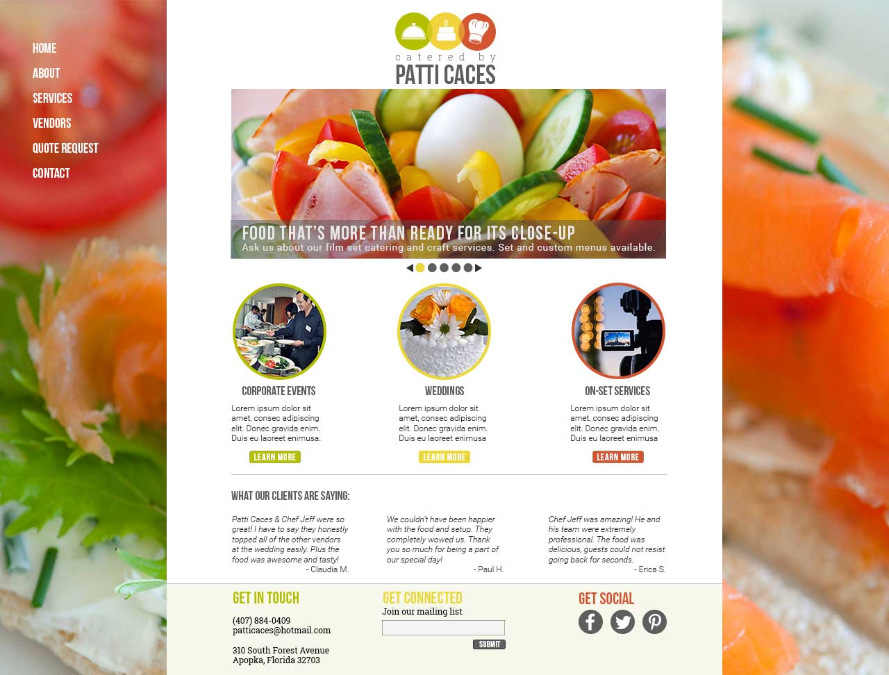
Full color webpage design based on wireframe
SUMMARY:
Aside from the various marketing channels I’ve designed for above, there are several other opportunities for further visual IMC out there. An e-newsletter that includes recipes, information about new products or services, photos and reviews could help remind potential clients of the company’s services so that they think of Catered by Patti Caces first when they have a special event. As mentioned before, Pinterest is a great place for visually interesting companies such as this one to subtly promote their business through the posting of photos, recipes, decor or event planning ideas. This could be a great opportunity for the company to not only show off their expertise, but to attract new clients.
In summary, it was a great pleasure to design a brand identity for Catered by Patti Caces. After reading through their entire website and seeking out reviews of the business, I knew a dedicated, client-focused business such as this one needed to have a greater brand presence not just for the good of the company, but for the good of those potential clients out there. With this in mind, I tried to design a visual identity and brand campaign that would appeal to a wide audience and portray the company as one that is experienced, welcoming and attractive to work with. Through this creative process, I learned a lot about designing for a real client and look forward to similarly challenging work in the future.