Disclaimer: This blog and its author are not affiliated with DSW in any way. Designs featuring their likeness are for educational use only.
My class continues to dig deeper into the practical uses of Photoshop in the creation of various marketing materials. Whether you’re measuring impressions or click-throughs, banner ads can be an extremely cost-efficient form of advertising. Although there is active debate over banner ads and their overall effectiveness, one thing is for sure — banner ads can reach an enormous amount of eyeballs, and that’s never a bad thing in advertising. This week, I created a proposed Q2 marketing campaign for shoe retailer, DSW and designed a set of banner ads in varying sizes to promote the campaign.
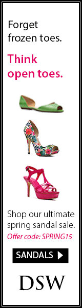
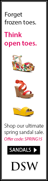
Banner ads can be tailored and displayed to a specific target audience. In my DSW campaign, I envision the ads being shown to female users who visit online retailers and fashion sites. Since Q2 covers the spring season, and with much of the country recovering from a hard winter, I created a campaign around a sandal sale to get women thinking about what they’ll wear in the (hopefully) upcoming warmer weather: “Forget frozen toes. Think open toes.”
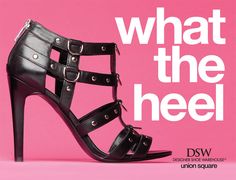
DSW’s current brand standards are completely centered around their products. Their slogan, “Where’d you get those shoes?”, puts the conversational focus right on your feet. Their logo and website design is based on a black and white color palette, allowing their trendy and colorful shoes to be the central focus. Advertisements (see examples below) typically feature large images of shoes, not always accompanied by models.
Screenshot of DSW website (dsw.com)
DSW’s advertising method is to entice viewers with the latest foot fashion trends, followed by the lure of discounted prices. This was the basis for my campaign. I chose to use stand-alone images of DSW’s colorful new sandal arrivals, taken as screen shots from the DSW website and cleaned up using the magic wand tool. I kept the rest of the color palette minimal to correspond with the ad’s destination, the DSW website. I did use a pop of pink to draw attention to certain text.
To keep consistent with the DSW website, I used the same typography: Myriad Pro for the body text, and, because I could not find a quality ready-made logo online, I used Trajan Pro to recreate the DSW logo (as verified to be the correct font by whatthefont.com). I also created the sandals button, identical to those used on DSW’s website to direct users to various departments, to give viewers something familiar to click on and lead them to the women’s sandals department page.
When creating each banner, I had to focus on size, margins and proportion of each piece of content so that all banners appeared balanced. The order of the content did not vary much. Font sizes were adjusted for each banner, ensuring the text was legible, correct in proportion with appropriate line-split. The “frozen toes” line is always a couple points smaller than the “open toes” line. The spring sale promotional text is formatted and sized so that it is aesthetically pleasing on the eye, with no awkward overhangs. For the images, they, too, had to be resized from banner to banner, and were realigned vertically for the taller skyscraper banner. For the button ad, only one shoe image was used and the sale promotion text dropped due to the limited size. Regardless of size, I used guide lines to ensure there was enough white space and margins around the content and that content was balanced on the left and right sides of the ads.

Leaderboard: 728 x 90

Rectangle: 300 x 250
Skyscraper: 160 x 600

Button: 320 x 75
I also created an animated GIF of my skyscraper banner in Photoshop using the Timeline panel. I created three sets of different shoes so that each slide of the GIF would display a different set. This way, a targeted viewer would see a wider range of DSW products and hopefully be that much more enticed to click on the ad. Click on the GIF below to open in new window and view animation.