Disclaimer: This blog and its author are not affiliated with discoverlosangeles.com or the Los Angeles Tourism & Convention Board in any way. Designs featuring their likeness are for educational use only.
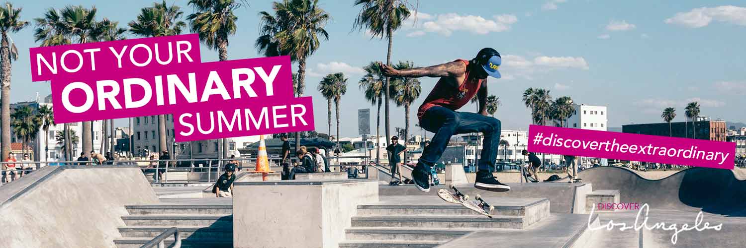
Social media continues to be a growing marketing platform for brands seeking to engage with the most consumers possible and to promote themselves to targeted groups of users. Despite the rising number of social media platforms, Facebook, Twitter and Instagram are considered three required social networks in which brands should actively participate. This week, I created a potential Summer 2015 brand awareness campaign for the Los Angeles Tourism & Convention Board and their LA tourism website, discoverlosangeles.com. I wanted to create a social media campaign targeted at young professionals and millennials, encouraging them to seek out a more exciting summer vacation and visit Los Angeles this summer. The title of the campaign is “Not your ordinary summer. Discover the extraordinary.”
My Facebook cover photos are set to 851 x 315 px. In my first design, I kept the text simple, horizontal across the middle of the image while on my second design I chose to stack the text on the right side in all caps. I added a drop shadow to the text for both to help it pop. Either design allows ample space for the Facebook profile picture. I also included the Discover Los Angeles logo on two of my Facebook designs, however on my third Facebook design, I included a hashtag, #discovertheextraordinary, instead as another way to promote engagement with the brand on social media. When the logo is not included in the cover image, it could appear in the profile picture. My third design is also drastically different from the prior two, using a grayscale photo with white text in pink text boxes. This pink color is a part of the discoverlosangeles.com color palette, adding another element of the brand to the campaign. Black and white color palettes featuring pops of color are a popular design for brands marketing to my same target audience. I created layer comps of my different Facebook designs and exported them as a PDF so they could easily be shared and seen in one document with the client, even if they don’t have Photoshop.
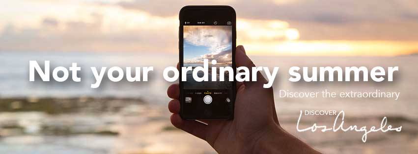
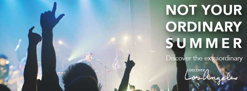
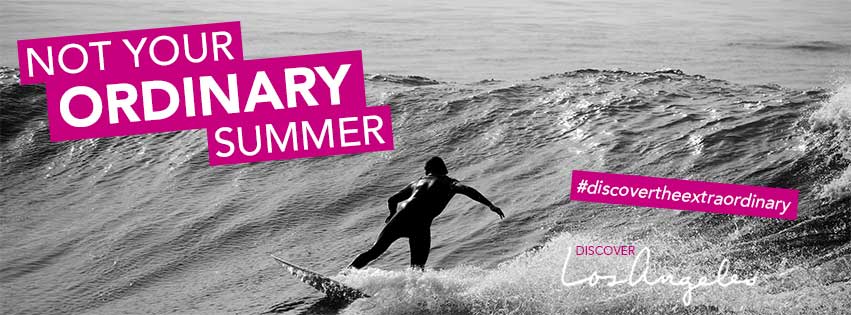
To build on my Facebook campaign, I would design a profile picture to complement the accompanying cover photo, tying in the respective color palette and typography. I would also create related Facebook timeline posts featuring information on upcoming exciting summer events in LA, as well as design additional sunny, enticing photos and graphics with the hashtag #discovertheextraordinary. To increase user engagement, we could create a more interactive aspect of the campaign with posts asking “How will you make your summer extraordinary?” that could even include a contest to win a trip to Los Angeles this summer, sponsored by the LA Tourism & Convention Board.
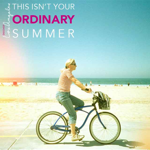
My Twitter cover photo is set to 1500 x 600 px. According to a 2015 Pew Research Center report on social media use, the majority of Twitter users are between 18 and 29 years old, so I decided to feature a cover image that would appeal more to this age group. I also opted to carry over the typography design and pink color from my third Facebook cover photo, including the hashtag to encourage user engagement. The result is an image that overall has a young and summery feel that would surely appeal to my target audience.
Finally, I created a simple banner that could be used on the discoverlosangeles.com Instagram page on a variety of photos. The banner features the logo (rotated vertically) and the statement “this isn’t your ordinary summer,” again reinforcing the campaign that Los Angeles is a more exciting place to be than any other this summer. I kept the banner text-based with a transparent background so it could be easily overlaid onto any Instagram photo, without taking away from the photograph itself. The text is in white with the pop of pink, adding just enough emphasis while remaining aesthetically pleasing.
Across my designs, I included enticing photographs of Los Angeles that would appeal to my target audience, including references to technology, music, and activities such as surfing and skateboarding. I used a contemporary sans serif font, Avenir, in various forms, across all of my designs and overlaid the text in white for a modern and trendy feel. To create a sense of integration across all of my social channels and follow the best practices of IMC, I used this same typography style and photographs with the same general look and feel. I used the same pop of pink in one of my Facebook banners, in my Twitter banner and in my Instagram design. If my client were to choose one of the Facebook banners without the pink, I would work with them to see if they would want to include the pink in that banner or to remove it from the Twitter and Instagram designs completely since I believe these designs would also work well in all white.
If I were to expand my social media campaign for the LA Tourism & Convention Board and discoverlosangeles.com, I would recommend including Pinterest and Snapchat. According to an article posted by TechCrunch, Snapchat is the third largest social network among users 18 – 34 years old (my target audience), behind Facebook and Instagram. Twitter comes in fourth, and Pinterest is fifth. Both Snapchat and Pinterest are built on the concept of sharing photos and re-sharing photos, which would fit in well with my current campaign. On Snapchat, my campaign can feature photos of the cool and interesting sites in Los Angeles, such as the iconic street art and unique individuals that represent the hipness of the city, along with our campaign hashtag and variations of our campaign copy. On Pinterest, we could create a board specifically for our campaign featuring photos and graphics that relate to the theme of “how to have an extraordinary summer” in Los Angeles. If my client chose to incorporate the pink color in their Facebook, Twitter and Instagram campaigns, I would want to incorporate this color in all of our graphics in some way (either in text or using the color replacement tool in photos or graphics) as a signature of the campaign.