Understanding Integrated Marketing Communication by creating my own web ad

Disclaimer: This blog and its author are not affiliated with Epicurious in any way. Designs featuring their likeness are for educational use only. 


This week, we discussed integrated marketing communication (IMC), a brand’s development and execution of a cohesive multi-channel identity campaign that immerses the target consumer in a consistent experience every time they encounter the brand. In this week’s assignment, I am highlighting the new visual IMC campaign launched this week by Epicurious, a recipe website owned by Condé Nast.

I really like using Epicurious to help find new recipes and I always enjoy the expert cooking tips they provide for those trickier dishes. Their previous website was pretty cluttered, a little bit too much for the user to focus on at one time. This week, Epicurious relaunched their entire brand, including a new, better website, promoting it across multiple platforms including social media and magazine advertising. Instead of just being a recipe website, Epicurious wants to be known as a “food utility” — an invaluable tool for home cooks to not only find new recipes, but to be inspired to push themselves to try even more.

Logos

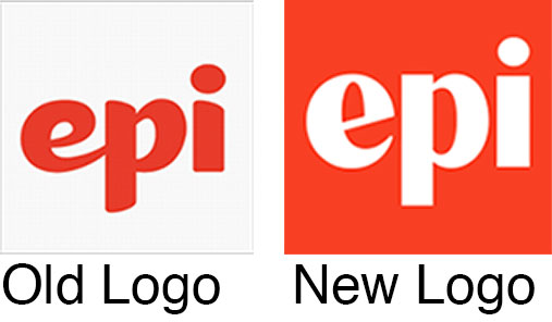
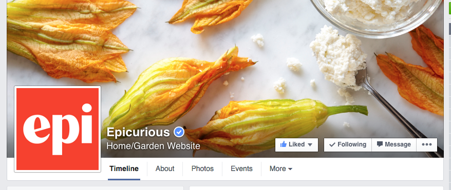
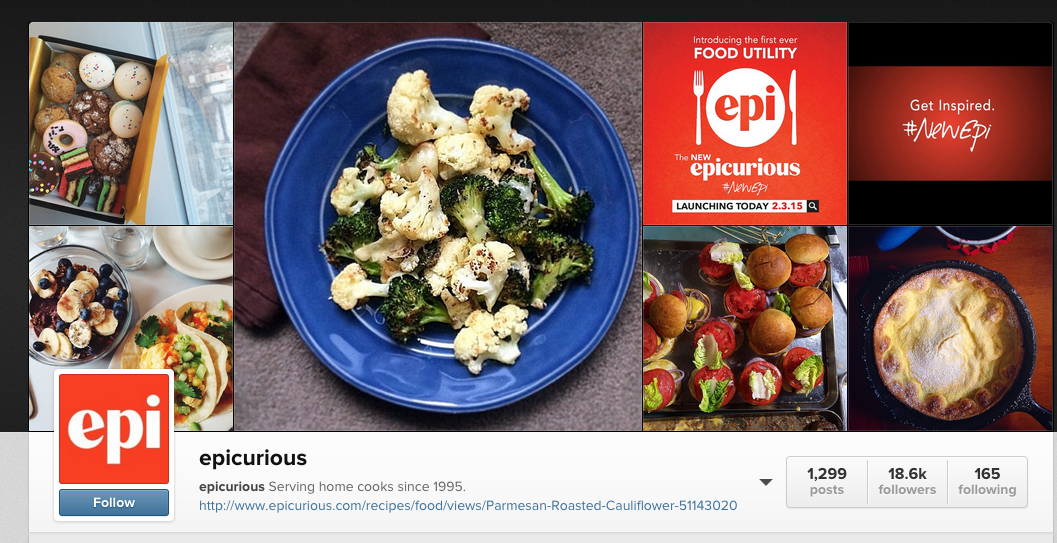
Epicurious’s visual IMC campaign features this message and refreshed new logo. For consistency purposes, the brand chose to keep with their same color palette of red and white. Not only did they post a detailed article on their rebranding on their website, Epicurious also posted the announcement and new logo to their Facebook, Twitter, and Instagram pages. 

Screen Shot 2015-02-06 at 10.02.34 AM

Screen Shot 2015-02-06 at 10.03.00 AMScreen Shot 2015-02-06 at 10.03.31 AM

The inspiration for my own Epicurious web advertisement came from a print ad they placed in Glamour magazine and a promotional video they created for the rebrand posted to their social media.

magazinead

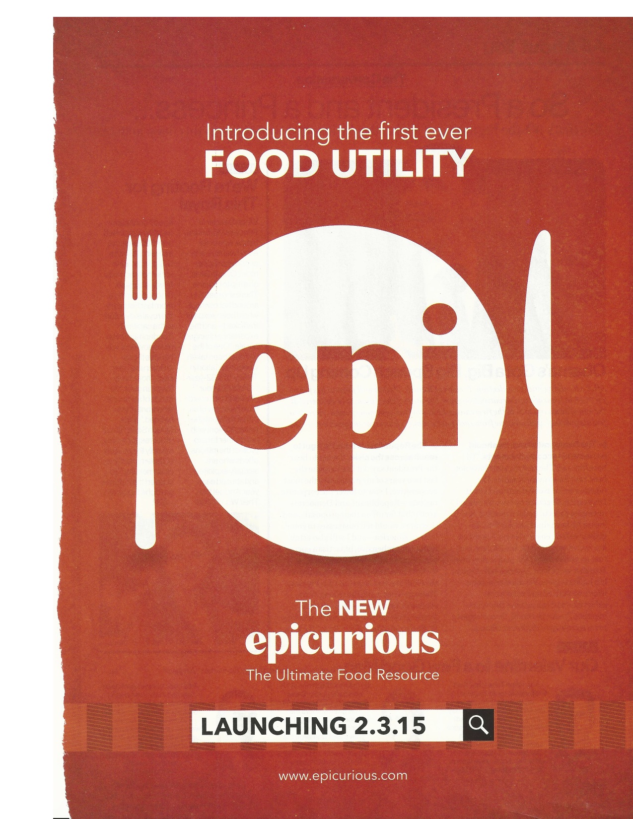
Full-page ad in February 2015 Glamour magazine


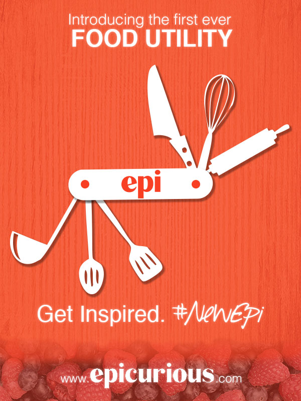
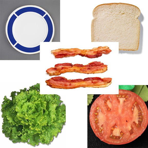
In my own web advertisement, I wanted to play off the branded message that Epicurious is more than just a recipe website, they are a valuable all-in-one resource – a “food utility.” When I thought of the word ‘utility,’ I thought of another all-in-one tool, a swiss army knife. This image became the basis of my design.

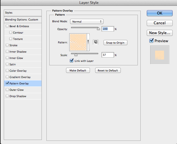
I started with a red background, sampled with the eye dropper from the Epicurious logo. To make my version of a swiss army knife, I created the custom shape in Illustrator for the handle. I then copied this shape into Photoshop. For its tools, I used a free cooking themed set of wingdings called Cocinitas (from dafont.com). I placed each cooking icon on its own layer and rotated and resized accordingly. I also converted each letter layer into a shape layer so they could be resized without having to adjust font size. Because I could not find a good high-resolution image of the Epicurious “epi” logo, I traced it in Illustrator before placing it into Photoshop. I then added two circles to form the handle screws. I selected all of the layers involved in the swiss army knife and linked the layers so I can resize them all at the same time. Finally, I added drop shadows to the handle and tools to add depth. I kept the shapes white, to keep consistent with the print ad.

Screen Shot 2015-02-06 at 10.44.06 AM

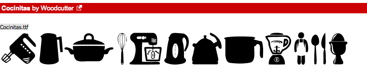
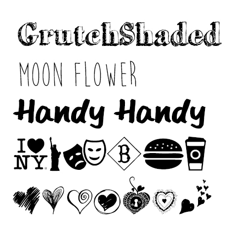
Free wingdings from Dafont.com

I then began to place the text. For the top message (“Introducing the first ever FOOD UTILITY”) I used Helvetica, the same font used in the original ad, in order to keep visual consistency. I took the bottom slogan (“Get Inspired. #NewEpi”) from their video. I was also able to use the same typography here, Helvetica and a free font, Southpaw, from dafont.com.

For the footer text, the full Epicurious logo, I found a larger image that I placed into Photoshop, however I had to select the background of this logo with the magic wand tool and discard it since the color did not exactly match my existing background. I then tried to clean up the white lettering of the logo by using the Sharpen Filter, and by using the paint bucket tool to fill in the lettering with more white. For all of the actual text in my advertisement, I added a slight Outer Glow effect so it appeared brighter against the red background.

Finally, I wanted to add some texture to the background. I started with a high resolution wood background image from Flickr and placed this behind my red background. I then added a layer mask to the red background layer and shaded in grey so to appear opaque, revealing the texture of the wood below.

Backgrounds

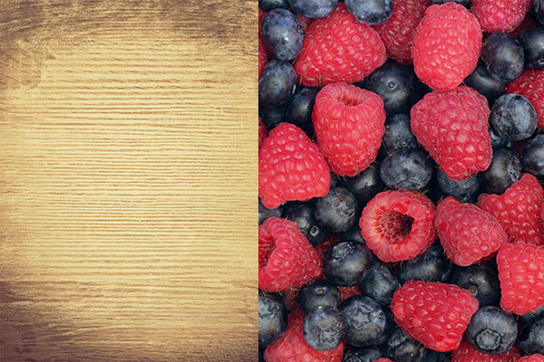
Background images used

To make the footer appear more interesting, I added another layer between the red and wood backgrounds with an image of berries (from Flickr) and added a mask with a black/white gradient so the berries would appear to fade into the wood. To improve the blending of the wood and the berries, I applied a Desaturate style to the berry layer and adjusted the opacity of the mask on the red background where the berries show through.

By keeping the messaging, color scheme, typography and general design consistent, I believe my advertisement would fit in well with the current Epicurious integrated marketing campaign. In my opinion, it may even better illustrate the message that their website is meant to be an invaluable tool to all home cooks, not just another recipe website.

Grunewald_DesignShowcase5

A Valentine’s Day chalkboard sign using layer styles & typography

Screen Shot 2015-01-28 at 8.04.37 PMThis week, I created a chalkboard sign in Photoshop using free downloadable layer styles and various typography. For my design, I chose to create a sign for local Seattle coffee chain (and a personal favorite), Caffe Vita for an upcoming fictitious Valentine’s Day special.

Before I started my project, I added the already-created layer styles simulating a chalk pattern provided by my instructor to my layer styles. I went to my Styles panel and selected “Load Styles.” I then chose one of the instructor-provided chalkboard backgrounds, set at 600 px by 800 px, as the base layer of my sign.

I wanted to use a variety of fun fonts in my design in order to replicate popular chalkboard sign styles, so I canvased my favorite free font website, dafont.com, for new typography. For my text, I chose GrutchShaded (a hip serif for the name of the coffee shop), Moon Flower (a skinny hand-drawn type for that homemade flare), and Handy Handy (an obviously handwritten font to add to the realism of the sign). For consistency, I chose to only use two fonts for the majority of the design.

Project Fonts

Typography used in this project

After I typed out my text, I added the chalk pattern layer styles I added to my panel earlier. I went to Window —> Styles to open my panel and went through each layer of text and added a colored chalk pattern. In order to vary the roughness of the chalk, I opened up the Pattern Overlay layer style menu and adjusted the scale of the pattern to fit my desired appearance for some layers.

Adjusting the scale of the chalk pattern overlay

Adjusting the scale of the chalk pattern overlay

I wanted to add some pictorial elements to my sign as well. Per my assignment instructions, I was only allowed to introduce pictures by way of wingding fonts. Again, I scoured dafont.com to find wingdings of coffee cups and hearts, to go along with the Valentine’s Day theme. I found New York, New York 2 (‘Z’ is a coffee cup), and heart-themed My Valentine’s Love.

When placing the coffee cups, I did so in two separate layers and flipped one cup horizontally (Edit —> Transform —> Flip Horizontal) in order for them to appear facing one another. I then joined these two layers so I could move and resize both cups at the same time. I also adjusted the scale of the pattern overlay.

When placing the hearts (in this case, “M”) I rotated the pictorial text about 45 degrees and adjusted the scale of the pattern overlay in order to appear like steam rising from the coffee cups.

I placed my instructor-provided decorative ornaments last by going to File —> Place Embedded and resizing the images (and my text) accordingly. I added the chalk pattern layer styles to these layers as well.

Finally, because I had so many different layers of text, I decided to group relevant layers into folders to improve my file organization.

See my final sign below! I really like the overall effect the chalk pattern layer style gave the typography and I think with the right choice of fun and handwritten fonts, the effect comes across fairly realistically. Now to crack how those baristas actually hand-draw those cool signs without any help from Photoshop!

Grunewald_DesignShowcase4

Using Photoshop adjustment layers to manipulate color & tone

This week, we learned about various Photoshop tools as well as how to use adjustment layers and layer masks to edit parts or all of an image without making permanent changes to the original.

From the photos provided by my instructor, I chose an image of a woman’s arm and hand holding a wedding bouquet. I decided to think of this project as preparing an image for a high-end wedding magazine editorial piece, similar to those in the annual Vogue wedding issue. I searched online for photo inspiration and found that many of these glossy wedding photos have a cooler tone, with the models skin taking on a “porcelain doll” effect:

Inspirational Vogue wedding photos

In my original photo (see below), the woman’s skin appears very warm in color, and the bouquet, the focal point of the photo, is too dull to compete with the bright white of the wedding dress behind it.Before I tried to replicate the lighting and color tone of the inspirational photos I found, I watched this Photoshop tutorial on adjustment layers in order to refresh myself on how each of them work.

Original instructor-provided image

Original instructor-provided image

To begin editing my photo, I used the clone stamp tool and duplicated some of the flowers in a separate transparent layer above the original image in order to double the size of the bouquet. I cleaned up the edges of the cloned portion with the eraser tool, creating one cohesive bouquet. I then merged those two layers into one titled “Base Image”, however I kept an original version of the image and original clone layer, grouped in my layers panel, turned off, just in case.

I essentially split my image into three different layer masks using adjustment layers:

Mask #1: Bouquet Adjustments: 

  • Vibrance layer:  I masked off everything except the bouquet itself. I turned the vibrance up a little bit to get the flowers to “pop” without appearing too fake.
  • Selective Color layer: I created this layer as a clipping mask to the Vibrance layer/masked image below it. Adjusted the Greens in the image, turned down the Yellow in the image so the leaves appeared a deep green in color.
  • Brightness/Contrast layer: Bumped the brightness up just a few points to improve the overall vibrancy. Created as clipping mask to the layer below.
  • Hue/Saturation layer: Increased saturation +30 points to finish off the bouquet. Created as clipping mask to the layer below.
  • I used the dodge tool to lighten the shadows on the far left pink roses and the sharpen tool to bring out more of the details in the inner rose petals.

Mask #2: Outside Bouquet Adjustments: 

  • Vibrance layer: I used Cmd+I (on a Mac) to invert my layer mask so that I could make adjustments to everything outside of the bouquet without having to create a new mask from scratch. I turned the vibrancy all the way down to zero. This drained the colors so the bouquet’s vibrancy became starker in comparison.
  • Selective Color layer: In order to cool off the overall tone of the background and woman, I adjusted the Whites, Neutrals, and Blacks in this layer, experimenting a lot, but typically increasing Cyan and Black. With the Neutrals, I decreased black in order to allow some of the peachy skin tone to remain. This adjustment layer added just a hint of a blue tint to the photo. I created this layer as a clipping mask to the Vibrance layer/masked image below.
  • Curves layer: I used Curves for further tone adjustments, bowing the graph’s curve down just slightly to further deepen the blue tine of the shadows in the photo. This effect created an even starker difference between the bright bouquet and the rest of the photo. Created as a clipping mask to the layer below.
  • I used the sharpen tool to bring out more detail in the pearl bracelet.

Mask #3: Skin Adjustments:

  • Selective Color layer: On top of the changes made to everything outside of the bouquet, I created a layer mask for just the woman’s arm in order to further adjust her skin tone to complete the “porcelain doll ” effect — skin that appears cool to the touch and whiter in tone. I adjusted the Whites, turning the Black down to -100, decreasing Magenta a few points to remove more of the pinker skin hues, and bumping up the Cyan to cool the tone until it was the appearance I desired. I also toned the Neutrals very slightly, turning Black down about 15 points.

With all of these adjustment layers turned on, the resulting effect is one I believe makes a solid attempt to mimic the look and feel of a wedding magazine editorial photo, perhaps accompanying an article about wedding bouquet trends.

My final edited image

My final edited image

Here is a side-by-side comparison of the original photograph (left) and my edited version (right):

Side by side comparison of original photo and my edited version

As part of my assignment, I also added a Black/White adjustment layer on top of all of my layers, turning down the opacity to 50%. When this layer is turned on, the effect on the image is almost that of a vintage color photograph, with a slight antique coloration to the flowers in the bouquet.

Grunewald_Week3BlackWhite

Black/White adjustment layer engaged at 50% opacity

Previous to this project, I did not often use adjustment layers in my personal Photoshop projects, however now that I know how to use them, I believe implementing them (instead of the Image –> Adjustments menu options) promotes much more creativity and experimentation, without the fear of having to start over with the original image file. In my experience, it’s the vast number of opportunities for experimentation in Photoshop that makes image editing so much fun!

Using Photoshop layers to make a BLT sandwich – yum!

Project 1 featuring a BLT sandwichMy first Photoshop assignment relies on the concept of utilizing layers to stack and organize images. In this assignment, a fictitious restaurant, Albert’s Grille, has asked me to make a graphic featuring a BLT sandwich. My instructor provided the basic images: a plate, a slice of white bread, lettuce, tomato and bacon strips. My instructions: make a sandwich, stacking each item in its own layer.

Before I started this assignment, I thought about what questions I would ask if Albert’s Grille was indeed a real new client:

  • What type of restaurant is Albert’s Grille? The image should fit in with the current restaurant branding.
  • What is the purpose of this graphic? Will it be shown on an online menu, or as a large enticing image on the restaurant’s homepage?

I decided to think of Albert’s Grille as a friendly neighborhood diner. The purpose of the image should be broad and useful across their website, meaning it should be enticing but also clearly show the contents of the sandwich, in case it’s used on an online menu.

Instructor-provided starting images

Instructor-provided starting images

I decided to work with a blank 8″ x 8″ canvas at 72 ppi and created my own plaid tablecloth pattern to use as a background using this online tutorial. Using the magic wand tool, I opened up and worked with each of the provided images to remove their white or busy backgrounds in favor of transparent ones, starting with the plate. If food images had a shadow or outline, I removed those as well using the magic wand or quick select tool, touching up with an eraser as needed. One at a time, I dragged each food item from their separate files into my project canvas, each item becoming a new layer.

Once all sandwich components were on my “plate,” I played with the canvas composition and image sizing. In order to have a better perspective of all sandwich components, I opted to move my plate slightly off canvas so I could have more of an angled view of the sandwich instead of completely top-down view. I also thought this view was more aesthetically pleasing. I rotated my bacon strips. I also duplicated the tomato slice layer and merged the two in order to make the tomato layer appear more realistic (otherwise that would be one giant tomato!). Once I was happy with the placement of my sandwich components, I created two new layers between the bacon and the top slice of bread – one for mayo and one for mustard. To create the mayo and mustard, I used a hard round brush and adjusted the shape dynamics (including size jitter, roundness jitter and scattering) in order to create more of a “squeeze bottle,” less uniform, effect.

Mayo/mustard brush settings

To create the logo around the bottom rim of the plate, I first downloaded the “Airstream” font from dafont.com, a font I believed fit with my mental image of Albert’s Grille. After adding my text to the canvas, I used the warped text feature (found in the option menu when the text tool is selected) to arc and bend the text to fit the curvature of the plate.

A few additional creative liberties:

  • I added drop shadows to the plate, bottom bread, lettuce, tomato and bacon layers by double-clicking on each layer and checking the “Drop Shadow” option on the menu (adjusting for opacity of the shadow as desired).
  • The bacon strips image appeared to be brighter than the other food images, so I decreased that layer’s brightness and contrast in order to make the lighting of that layer more consistent with the others (found in the top menu under Image –> Adjustments –> Brightness/Contrast).
  • Burn tool icon

    Burn tool

    I thought the plain white bread on top of the sandwich looked a bit bland. I decided to “toast” the bread using the burn tool on this layer. I never used the burn tool prior to this project, so I looked at this tutorial for a basic idea and practiced “toasting” the slice of bread image until I settled on the effect I wanted. I’m honestly still not 100% sure how to use this tool, however I know by adjusting the exposure of the tool, as well as the color (white vs. grey vs. black), you can “burn” in different tones to achieve a desired affect. I know this tool is not primarily used for toasting bread in Photoshop, so I look forward to learning about its more practical uses later in this course.

Overall, I’m happy with the way the image turned out. I not only built upon my existing knowledge of layers, but also learned how to use new tools. Below is a full-size version of the final graphic:

Project 1 featuring a BLT sandwich

Welcome to my portfolio

Vicki About MeHello, and thank you for visiting my new portfolio site! My name is Vicki Grunewald and I am pursuing my master’s degree in Mass Communication with a focus on web design and online communication through the University of Florida. I live in the Seattle area and enjoy all the food, wine and outdoor adventures the Pacific Northwest offers. Please visit my About Me page to learn more about my background.

I am currently enrolled in UF course VIC 5325: Digital Imagery in Web Design. Throughout the semester, I will share original creative works inspired by course projects and the process I use to bring them to light. I hope to learn all Photoshop has to offer so as to not only create graphic designs and materials that are beautiful, but also fresh and marketable. In this course, I look forward to discussing the principles that make a good design well-crafted and using those concepts to shape my own works. After I achieve my master’s degree, I plan to pursue a career as a freelance web designer. Please check back each week as I continue to build my portfolio and work towards my goal.