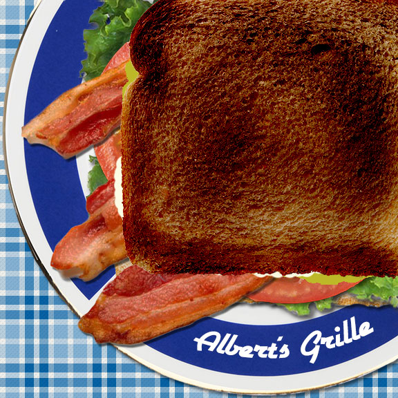
 My first Photoshop assignment relies on the concept of utilizing layers to stack and organize images. In this assignment, a fictitious restaurant, Albert’s Grille, has asked me to make a graphic featuring a BLT sandwich. My instructor provided the basic images: a plate, a slice of white bread, lettuce, tomato and bacon strips. My instructions: make a sandwich, stacking each item in its own layer.
Before I started this assignment, I thought about what questions I would ask if Albert’s Grille was indeed a real new client:
- What type of restaurant is Albert’s Grille? The image should fit in with the current restaurant branding.
- What is the purpose of this graphic? Will it be shown on an online menu, or as a large enticing image on the restaurant’s homepage?
I decided to think of Albert’s Grille as a friendly neighborhood diner. The purpose of the image should be broad and useful across their website, meaning it should be enticing but also clearly show the contents of the sandwich, in case it’s used on an online menu.
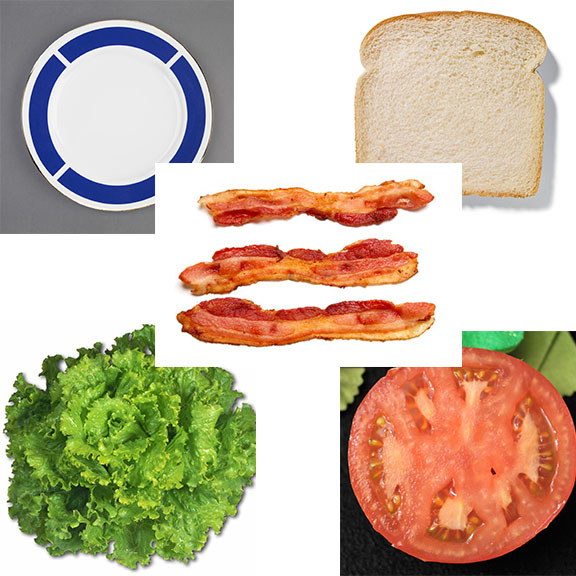
Instructor-provided starting images
I decided to work with a blank 8″ x 8″ canvas at 72 ppi and created my own plaid tablecloth pattern to use as a background using this online tutorial. Using the magic wand tool, I opened up and worked with each of the provided images to remove their white or busy backgrounds in favor of transparent ones, starting with the plate. If food images had a shadow or outline, I removed those as well using the magic wand or quick select tool, touching up with an eraser as needed. One at a time, I dragged each food item from their separate files into my project canvas, each item becoming a new layer.
Once all sandwich components were on my “plate,” I played with the canvas composition and image sizing. In order to have a better perspective of all sandwich components, I opted to move my plate slightly off canvas so I could have more of an angled view of the sandwich instead of completely top-down view. I also thought this view was more aesthetically pleasing. I rotated my bacon strips. I also duplicated the tomato slice layer and merged the two in order to make the tomato layer appear more realistic (otherwise that would be one giant tomato!). Once I was happy with the placement of my sandwich components, I created two new layers between the bacon and the top slice of bread – one for mayo and one for mustard. To create the mayo and mustard, I used a hard round brush and adjusted the shape dynamics (including size jitter, roundness jitter and scattering) in order to create more of a “squeeze bottle,” less uniform, effect.
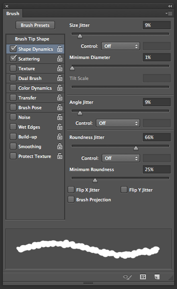
Mayo/mustard brush settings
To create the logo around the bottom rim of the plate, I first downloaded the “Airstream” font from dafont.com, a font I believed fit with my mental image of Albert’s Grille. After adding my text to the canvas, I used the warped text feature (found in the option menu when the text tool is selected) to arc and bend the text to fit the curvature of the plate.
A few additional creative liberties:
- I added drop shadows to the plate, bottom bread, lettuce, tomato and bacon layers by double-clicking on each layer and checking the “Drop Shadow” option on the menu (adjusting for opacity of the shadow as desired).
- The bacon strips image appeared to be brighter than the other food images, so I decreased that layer’s brightness and contrast in order to make the lighting of that layer more consistent with the others (found in the top menu under Image –> Adjustments –> Brightness/Contrast).
-

Burn tool
I thought the plain white bread on top of the sandwich looked a bit bland. I decided to “toast” the bread using the burn tool on this layer. I never used the burn tool prior to this project, so I looked at this tutorial for a basic idea and practiced “toasting” the slice of bread image until I settled on the effect I wanted. I’m honestly still not 100% sure how to use this tool, however I know by adjusting the exposure of the tool, as well as the color (white vs. grey vs. black), you can “burn” in different tones to achieve a desired affect. I know this tool is not primarily used for toasting bread in Photoshop, so I look forward to learning about its more practical uses later in this course.
Overall, I’m happy with the way the image turned out. I not only built upon my existing knowledge of layers, but also learned how to use new tools. Below is a full-size version of the final graphic:
One thought on “Using Photoshop layers to make a BLT sandwich – yum!”